Welcome to my Open Notebook

This is an Open Notebook with Selected Content - Delayed. All content is licenced with CC-BY. Find out more Here.

ONS-SCD.png

test-data-for-classification-trees

A fictitious sample dataset

For discussion, I’ll use a fictional example dataset that I’m using to work through some statistical theory related to Classification and Regression Trees (CART). In the motivating example use case we are interested in predicting the civil status (married, single, divorced/widowed) of individuals from their sex (male, female) and sector of activity (primary, secondary, tertiary). The data set is composed of 273 cases.

The data (and related statistical theory) come from:

  • Ritschard, G. (2006). Computing and using the deviance with classification trees. In Compstat 2006 - Proceedings in Computational Statistics 17th Symposium Held in Rome, Italy, 2006. Retrieved from This Link

  • Ritschard, G., Pisetta, V., & Zighed, D. (2008). Inducing and evaluating classification trees with statistical implicative criteria. Statistical Implicative Analysis. Studies in Computational Intelligence Volume 127, pp 397-419. Retrieved from This Link

Code:

# copy and paste the data from the PDF (Table 1 in both papers)
civst_gend_sector  <- read.csv(textConnection(
    "civil_status gender activity_sector number_of_cases
         married   male         primary              50
         married   male       secondary              40
         married   male        tertiary               6
         married female         primary               0
         married female       secondary              14
         married female        tertiary              10
          single   male         primary               5
          single   male       secondary               5
          single   male        tertiary              12
          single female         primary              50
          single female       secondary              30
          single female        tertiary              18
divorced/widowed   male         primary               5
divorced/widowed   male       secondary               8
divorced/widowed   male        tertiary              10
divorced/widowed female         primary               6
divorced/widowed female       secondary               2
divorced/widowed female        tertiary               2
"),sep = "")

# save this to my personal R utilities package "disentangle" 
# for use later when I am exploring functions
dir.create("inst/extdata", recursive=T)
write.csv(civst_gend_sector, "inst/extdata/civst_gend_sector.csv", row.names = F)

That is fine and good, we can use the case weights option to include number of cases but sometimes we want to use one row per person. In the next chunk of code I;ll reformat the data, and also add another fictitious variable called income and contrive an example where a certain group earns less based on their activity sector.

Code:

df <- as.data.frame(matrix(NA, nrow = 0, ncol = 3))
for(i in 1:nrow(civst_gend_sector))
    {
    #    i <- 1
        n <- civst_gend_sector$number_of_cases[i]
        if(n == 0) next
        for(j in 1:n)
            {
              df <- rbind(df, civst_gend_sector[i,1:3])              
            }
 
    }

df$income  <- rnorm(nrow(df), 1000,200)
# Let us say secondary men earn less
df$income[df$gender == "male" & df$activity == "secondary"]  <- df$income[df$gender == "male" & df$activity == "secondary"] - 500
str(df)
# save this for use later
write.csv(df, "inst/extdata/civst_gend_sector_full.csv", row.names = F)

Motivating reason for using these data

Classification and Regression Tree models (also referred to as Decision Trees) are one of the building blocks of data mining and a great tool for Exploratory Data Analysis.

I’ve mostly used Regression Trees in the past but recently got some work with social science data where Classification Trees were needed. I wanted to assess the deviance as well as the misclassification error rate for measuring the descriptive power of the tree. While this is a easy with Regression Trees it became obvious that it was not so easy with Classification Trees. This is because Classification Trees are most often evaluated by means of the error rate. The problem with the error rate is that it is not that helpful for assessing the descriptive capacity of the tree.

For example if we look at the reduction in deviance between the Null model and the fitted tree we can say that the tree explains about XYZ% of the variation. We can also test if this is a statistically significant reduction based on a chi-squared test.

Consider this example from page 310 of Hastie, T., Tibshirani, R., & Friedman, J. (2001). The elements of statistical learning. 2nd Edition:

  • in a two-class problem with 400 observations in each class (denote this by (400, 400))
  • suppose one split created nodes (300, 100) and (100, 300),
  • the other created nodes (200, 400) and (200, 0).
  • Both splits produce a misclassification rate of 0.25, but the second split produces a pure node and is probably preferable.

During the course of my research to try to identify the best available method to implement in my analysis I found a useful series of papers by Ritschard, with a worked example using SPSS. I hope to translate that to R in the future, but the first thing I did was grab the example data used in several of those papers out of the PDF. So seeing as this was a public dataset (I use a lot of restricted data) and because I want to be able to use it to demonstrate the use of any R functions I find or write… I thought would publish it properly.

The Tree Model

So just before we leave Ritschard and the CART method, let’s just fit the model. Let’s also install my R utilities package “disentangle”, to test that we can access the data from it.

In this analysis the civil status is the outcome (or response or decision or dependent) variable, while sex and activity sector are the predictors (or condition or independent variables).

Code:

# func
require(rpart)
require(partykit) 
require(devtools)
install_github("disentangle", "ivanhanigan")

# load
fpath <- system.file(file.path("extdata", "civst_gend_sector.csv"),
                     package = "disentangle"
                     )
civst_gend_sector <- read.csv(fpath)

# clean
str(civst_gend_sector)

# do
fit <- rpart(civil_status ~ gender + activity_sector,
             data = civst_gend_sector, weights = number_of_cases,
             control=rpart.control(minsplit=1))
# NB need minsplit to be adjusted for weights.
summary(fit)
  
# report
dir.create("images")
png("images/fit1.png", 1000, 480)
plot(as.party(fit))
dev.off()

The Result
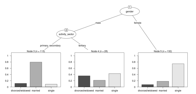
fit1.png

Posted in  Data Documentation


simple-example-using-nmmaps

I will use the NMMAPSlite datasets for a simple example of what I am trying to do.

Code: get nmmaps data

# func
if(!require(NMMAPSlite)) install.packages('NMMAPSlite');require(NMMAPSlite)
require(mgcv)
require(splines)

######################################################
# load  
setwd('data')
initDB('data/NMMAPS') # this requires that we connect to the web,
                      # so lets get local copies
setwd('..')
cities <- getMetaData('cities')
head(cities)
citieslist <- cities$cityname
# write out a few cities for access later
for(city_i in citieslist[sample(1:nrow(cities), 9)])
{
 city <- subset(cities, cityname == city_i)$city
 data <- readCity(city)
 write.table(data, file.path('data', paste(city_i, '.csv',sep='')),
 row.names = F, sep = ',')
}
# these are all tiny, go some big ones
for(city_i in c('New York', 'Los Angeles', 'Madison', 'Boston'))
{
 city <- subset(cities, cityname == city_i)$city
 data <- readCity(city)
 write.table(data, file.path('data', paste(city_i, '.csv',sep='')),
 row.names = F, sep = ',')
}

######################################################
# now we can use these locally
dir("data")
city <- "Chicago"
data <- read.csv(sprintf("data/%s.csv", city), header=T)
str(data)
data$yy <- substr(data$date,1,4)
data$date <- as.Date(data$date)
######################################################
# check
par(mfrow=c(2,1), mar=c(4,4,3,1))
with(subset(data[,c(1,15:25)], agecat == '75p'),
  plot(date, tmax)
 )
with(subset(data[,c(1,4,15:25)], agecat == '75p'),
        plot(date, cvd, type ='l', col = 'grey')
        )
with(subset(data[,c(1,4,15:25)], agecat == '75p'),
        lines(lowess(date, cvd, f = 0.015))
        )
# I am worried about that outlier
data$date[which(data$cvd > 100)]
# [1] "1995-07-15" "1995-07-16"
 
######################################################
# do standard NMMAPS timeseries poisson GAM model
numYears<-length(names(table(data$yy)))
df <- subset(data, agecat == '75p')
df$time <- as.numeric(df$date)
fit <- gam(cvd ~ s(pm10tmean) + s(tmax) + s(dptp) + s(time, k= 7*numYears, fx=T), data = df, family = poisson)
# plot of response functions
par(mfrow=c(2,2))
plot(fit)
dev.off()
 
######################################################
# some diagnostics
summary(fit)
# note the R-sq.(adj) =   0.21
gam.check(fit)
# note the lack of a leverage plot.  for that we need glm
 
######################################################
# do same model as glm
fit2 <- glm(cvd ~ pm10tmean + ns(tmax, df = 8) + ns(dptp, df = 4) + ns(time, df = 7*numYears), data = df, family = poisson)
# plot responses
par(mfrow=c(2,2))
termplot(fit2, se =T)
dev.off()
 
# plot prediction
df$predictedCvd <- predict(fit2, df, 'response')
# baseline is given by the intercept
fit3 <- glm(cvd ~ 1, data = df, family = poisson)
df$baseline <-  predict(fit3, df, 'response')
with(subset(df, date>=as.Date('1995-01-01') & date <= as.Date('1995-07-31')),
 plot(date, cvd, type ='l', col = 'grey')
        )
with(subset(df, date>=as.Date('1995-01-01') & date <= as.Date('1995-07-31')),
        lines(date,predictedCvd)
        )
with(subset(df, date>=as.Date('1995-01-01') & date <= as.Date('1995-07-31')),
 lines(date,baseline)
        )
######################################################
# some diagnostics
# need to load a function to calculate poisson adjusted R squared
# original S code from
# The formula for pseudo-R^2 is taken from G. S. Maddalla,
# Limited-dependent and Qualitative Variables in Econometrics, Cambridge:Cambridge Univ. Press, 1983. page 40, equation 2.50.
RsquaredGlm <- function(o) {
 n <- length(o$residuals)
 ll <- logLik(o)[1]
 ll_0 <- logLik(update(o,~1))[1]
 R2 <- (1 - exp(((-2*ll) - (-2*ll_0))/n))/(1 - exp( - (-2*ll_0)/n))
 names(R2) <- 'pseudo.Rsquared'
 R2
 }
RsquaredGlm(fit2)
# 0.51
# the difference is presumably due to the arguments about how to account for unexplainable variance in the poisson distribution?
 
# significance of spline terms
drop1(fit2, test='Chisq')
# also note AIC. best model includes all of these terms
# BIC can be computed instead (but still labelled AIC) using
drop1(fit2, test='Chisq', k = log(nrow(data)))
 
# diagnostic plots
par(mfrow=c(2,2))
plot(fit2)
dev.off()
# note high leverage plus residuals points are labelled
# leverage doesn't seem to be too high though which is good
# NB the numbers refer to the row.names attribute which still refer to the original dataset, not this subset
df[row.names(df) %in% c(9354,9356),]$date
# as suspected [1] "1995-07-15" "1995-07-16"
 
######################################################
# so lets re run without these obs
df2 <- df[!row.names(df) %in% c(9354,9356),]
# to avoid duplicating code just re run fit2, replacing data=df with df2
# tmax still significant but not so extreme
# check diagnostic plots again
par(mfrow=c(2,2))
plot(fit2)
dev.off()
# looks like a well behaved model now.
 
# if we were still worried about any high leverage values we could identify these with
df3 <- na.omit(df2[,c('cvd','pm10tmean','tmax','dptp','time')])
df3$hatvalue <- hatvalues(fit2)
df3$res <- residuals(fit2, 'pearson')
with(df3, plot(hatvalue, res))
# this is the same as the fourth default glm diagnostic plot, which they label x-axis as leverage
summary(df3$hatvalue)
# gives us an idea of the distribution of hat values
# decide on a threshold and look at it
hatThreshold <- 0.1
with(subset(df3, hatvalue > hatThreshold), points(hatvalue, res, col = 'red', pch = 16))
abline(0,0)
segments(hatThreshold,-2,hatThreshold,15)
dev.off()
 
fit3 <- glm(cvd ~ pm10tmean + ns(tmax, df = 8) + ns(dptp, df = 4) + ns(time, df = 7*numYears), data = subset(df3, hatvalue < hatThreshold), family = poisson)
par(mfrow=c(2,2))
termplot(fit3, se = T)
# same same
plot(fit3)
# no better
 
# or we could go nuts with a whole number of ways of estimating influence
# check all influential observations
infl <- influence.measures(fit2)
# which observations 'are' influential
inflk <- which(apply(infl$is.inf, 1, any))
length(inflk)
 
 
######################################################
# now what about serial autocorrelation in the residuals?
 
par(mfrow = c(2,1))
with(df3, acf(res))
with(df3, pacf(res))
dev.off()


######################################################
# just check for overdispersion
fit <- gam(cvd ~ s(pm10tmean) + s(tmax) + s(dptp) + s(time, k= 7*numYears, fx=T), data = df, family = quasipoisson)
summary(fit)
# note the Scale est. = 1.1627
# alternatively check the glm
fit2 <- glm(cvd ~ pm10tmean + ns(tmax, df = 8) + ns(dptp, df = 4) + ns(time, df = 7*numYears), data = df, family = quasipoisson)
summary(fit2)
# (Dispersion parameter for quasipoisson family taken to be 1.222640)
# this is probably near enough to support a standard poisson model...
 
# if we have overdispersion we can use QAIC (A quasi- mode does not have a likelihood and so does not have an AIC,  by definition)
# we can use the poisson model and calculate the overdispersion
fit2 <- glm(cvd ~ pm10tmean + ns(tmax, df = 8) + ns(dptp, df = 4) + ns(time, df = 7*numYears), data = df, family = poisson)
1- pchisq(deviance(fit2), df.residual(fit2))
 
# QAIC, c is the variance inflation factor, the ratio of the residual deviance of the global (most complicated) model to the residual degrees of freedom
c=deviance(fit2)/df.residual(fit2)
QAIC.1=-2*logLik(fit2)/c + 2*(length(coef(fit2)) + 1)
QAIC.1
 
# Actually lets use QAICc which is more conservative about parameters,
QAICc.1=-2*logLik(fit2)/c + 2*(length(coef(fit2)) + 1) + 2*(length(coef(fit2)) + 1)*(length(coef(fit2)) + 1 + 1)/(nrow(na.omit(df[,c('cvd','pm10tmean','tmax','dptp','time')]))- (length(coef(fit2))+1)-1)
QAICc.1
 
 
######################################################
# the following is old work, some may be interesting
# such as the use of sinusoidal wave instead of smooth function of time
 
 
# # sine wave
# timevar <- as.data.frame(names(table(df$date)))
# index <- 1:length(names(table(df$date)))
# timevar$time2 <- index / (length(index) / (length(index)/365.25))
# names(timevar) <- c('date','timevar')
# timevar$date <- as.Date(timevar$date)
# df <- merge(df,timevar)
 
# fit <- gam(cvd ~ s(tmax) + s(dptp) + sin(timevar * 2 * pi) + cos(timevar * 2 * pi) + ns(time, df = numYears), data = df, family = poisson)
# summary(fit)
# par(mfrow=c(3,2))
# plot(fit, all.terms = T)
# dev.off()
 
# # now just explore the season fit
# fit <- gam(cvd ~ sin(timevar * 2 * pi) + cos(timevar * 2 * pi) + ns(time, df = numYears), data = df, family = poisson)
# yhat <- predict(fit)
# head(yhat)
 
# with(df, plot(date,cvd,type = 'l',col='grey', ylim = c(15,55)))
# lines(df[,'date'],exp(yhat),col='red')
 
 
# # drop1(fit, test= 'Chisq')
 
# # drop1 only works in glm?
# # fit with weather variables, use degrees of freedom estimated by gam
# fit <- glm(cvd ~ ns(tmax,8) + ns(dptp,2) + sin(timevar * 2 * pi) + cos(timevar * 2 * pi) + ns(time, df = numYears), data = df, family = poisson)
# drop1(fit, test= 'Chisq')
# # use plot.glm for diagnostics
# par(mfrow=c(2,2))
# plot(fit)
# par(mfrow=c(3,2))
# termplot(fit, se=T)
# dev.off()
 
# # cyclic spline, overlay on prior sinusoidal
# with(df, plot(date,cvd,type = 'l',col='grey', ylim = c(0,55)))
# lines(df[,'date'],exp(yhat),col='red')
 
# df$daynum <- as.numeric(format(df$date, "%j"))
# df[360:370,c('date','daynum')]
# fit <- gam(cvd ~ s(daynum, k=3, fx=T, bs = 'cp') +  s(time, k = numYears, fx = T), data = df, family = poisson)
# yhat2 <- predict(fit)
# head(yhat2)
 
# lines(df[,'date'],exp(yhat2),col='blue')
 
 
# par(mfrow=c(1,2))
# plot(fit)
 
 
# # fit weather with season
# fit <- gam(cvd ~ s(tmax) + s(dptp) +
  # s(daynum, k=3, fx=T, bs = 'cp') +  s(time, k = numYears, fx = T), data = df, family = poisson)
# par(mfrow=c(2,2))
# plot(fit)
 
# summary(fit)

Posted in  spatial dependence


reviewing-lessons

Introduction

This post is an attempt to put together a standard framework for reviewing lessons. I’ve been to numerous workshops, master classes, tutorials and lectures and always take ad hoc notes that I generally re-write and re-organise afterwards. I hope to develop a clearer methodology for reviewing what I learnt in each lesson.

Context

  • When: Either just the date and time or include more context like the broader event such as a conference, season, public holidays.

  • Who: The presenter will give a bio at the start so make notes, especially to identify what disciplinary perspective they come from.

  • Where: Includes the address, city, lecture theatre. These are cues for memory.

  • Why: Both why is the presenter here talking and also why am I hear listening. It is important to critically reflect on what I want to get out of this lesson.

  • What: What is this lesson all about? This might start with a synopsis overview and will probably move on to a sequence of notes as the presenter’s narrative unfolds, and my thoughts on the topic evolve.

Three Stages: Thesis, Antithesis, Synthesis

A guiding principle I use for writing the ‘What’ section is the three stages: thesis, antithesis, synthesis. I am not a philosopher so I don’t know the proper use of these concepts in that discipline, but for me they are useful to structure my notes as I go through the process of a lesson. Here is how I think of these stages:

  • Thesis: This is where I might pick out the key topics that are being presented, and write down my prior knowledge and preconceptions about the topic.

  • Antithesis: What’s the main message(s) of the presenter? What are their priorities? What secondary (surrogate) topics emerge around the main points? If I bring questions to the lesson are they answered by the presenter? If not why?

  • Synthesis: My new understanding of the topic.

Other tools

Other things I use are:

  • Mind maps: a central topic with a spiderweb of links extending out in a circle.
  • TODO

Posted in  research methods


spatially-structured-timeseries-vs-spatiotemporal-modelling

Spatiotemporal Regression Modelling

Spatiotemporal Regression Modelling

1 Spatially Structured Timeseries Vs Spatiotemporal Modelling

In my last post about spatiotemporal regression modelling I mentioned that I am mostly interested in "spatially structured time-series models" rather than spatial models at a single point in time. By this I mean that we have several neighbouring areal units observed over a period of time. In this framework the general methods of time series modelling are used to control for temporal autocorrelation. However this makes the methods of spatial error and spatial lag models tricky because the spatial autocorrelation needs to be assessed at many points in time.

I want to expand more on this topic because I want to be clear that the organisation of the material I am aiming to bring to this notebook topic is not aimed at purely spatial regression models (there is a lot of material and tools out there already for that). I am trying with these notes to document my learning steps toward integrating spatial methods with time-series methods to allow me to practice (and understand) spatiotemporal regression modelling.

1.1 Spatially Structured Time Series

In my most successful previous attempt to conduct a spatiotemporal analysis of Suicide and Droughts I built on my knowledge of time-series regression models from single-city air pollution studies where the whole city is the unit of analysis and the temporal variation is modelled with controlling techniques for temporal autocorrelation. These techniques are also valid for multi-city studies because it is pretty safe to assume the cities are all independent at each time point. I structured my study by Eleven large zones (Census Statistical Divisions) of NSW and assumed each of these would vary over time independent of each other, and I fitted a zone-specific time trend and cycle. This is what I call "spatially structured time-series" modelling.

I justify using this model in this case because aggregating up to these very large regions will diminish the possibility of spatial autocorrelation and because Droughts vary over large spatial zones too, we will not suffer from exposure misclassificaiton bias.

So this model is a simple time-series regression (with trend and seasonality) and an additional term for spatial Zone.

\begin{eqnarray*} log({\color{red} O_{ijk}}) & = & s({\color{red}ExposureVariable}) + {\color{blue} OtherExplanators} \\ & & + AgeGroup_{i} + Sex_{j} \\ & & + {\color{blue} SpatialZone_{k}} \\ & & + sin(Time \times 2 \times \pi) + cos(Time \times 2 \times \pi) \\ & & + Trend \\ & & + offset({\color{blue} log(Pop_{ijk})})\\ \end{eqnarray*}

Where:

  • \({\color{red}O_{ijk}}\) = Outcome (counts) by Age\(_{i}\), Sex\(_{j}\) and SpatialZone\(_{k}\)
  • {\color{red}ExposureVariable} = Data with {\color{red}Restrictive Intellectual Property~(IP)}
  • {\color{blue}OtherExplanators} = Other {\color{blue}Less Restricted} Explanatory variables
  • s( ) = penalized regression splines
  • \({\color{blue} SpatialZone_{k}}\) = {\color{blue} Less Restricted} data representing the \(SpatialZone_{k}\)
  • Trend = Longterm smooth trend(s)
  • \({\color{blue}Pop_{ijk}}\) = interpolated Census populations, by time in each group

1.2 TODO Spatiotemporal modelling

In contrast to the above model for modelling exposures that have fine resolution spatial variation (such as air pollution) the exposure misclassification effect of aggregating up to very large spatial zones will conteract the benefits of avoiding spatially autocorrelated errors and this might be unacceptable for certain research questions. Therefore it is important to move toward a spatiotemporal regression model that replaces the \(SpatialZone_{k}\) term with a more spatial error or spatial lag approach.

</html>

Posted in  spatial dependence


reflections-bob-haining-update

1 Update on reflections from Bob Haining's Lecture

Earlier this year Prof Bob Haining from the Geography Department Cambridge visited and gave us a great lecture on spatial regression.

This Tuesday at the GIS Forum we were lucky to be joined by statistician Phil Kokic from CSIRO who had heard we'd be discussing spatial autocorrelation (Phil is my PhD supervisor). Here are some quick notes I made:

1.1 CART Tree analysis that addresses the (potential)spatial autocorrelation problem

We started off the discussion with an assessment of the approach described in this post Classification Trees and Spatial Autocorrelation.

I've been thinking more and more about decision trees/CART/random forest methods for selecting a subset of relevant variables (and interations) for use in GLM or GAM model construction. In a perfect world I'd have data on the main predictor I wanted to model and enough data about all the relevant other predictors (especially confounding or modifying variables) to ensure I get a 'well behaved model'. But with all the data around and so many potentially plausible relationships one might choose to include we need a way to narrow down these to just include the most important covariates, confounders and interactions. CART or some variation on it seems a good way to do this, but is prone to the potential problem of spatially correlated errors too.

The idea from that blog post is:

"compute the classification tree, calculate residuals and use it for a Mantel-test and Mantel correlograms. The Mantel correlograms test differrences in dissimilarities of the residuals across several spatial distances and thus enable you to detect lag-distances where possible spatial autocorrelation vanishes. …If encounter autocorrelation… try to use subsamples of the data avoiding resampling within the lag-distance.."

I think the workflow would be to

  • fit the classification tree (Question: best to use all the data or with a sample like using cross-validation)
  • get the residuals and visually assess the lagged distances plot provided by the Mantel correlogram. Decide on a threshold (Question: is there an objective way to do this?).
  • Sample from the data and select out from this sample only data from pairs with distances greater than the threshold (have to keep one out of each close pair or else we'd only be getting data from the sparsely sampled parts of our study region).

We all agreed this sounded OK, but only avoids the problem of spatial autocorrelation (and loses data).

1.2 Modeling with control for spatial autocorrelation

So we all agreed we'd prefer if our model can control for spatial autocorrelation. I confessed that I'd always found the GeoBUGS tutorial and other tutorials about Bayesian methods for this very difficult and would really like a "Simple" way to make the problem go away. So first we briefly reviewed Prof Hainings 3 equations again:

NOTE: THE FOLLOWING IDEAS WORK BEST FOR AREAL DATA.

1.3 The Spatial Error Model

\(Y_{i} = \beta_{0} + \beta_{1} X_{1i} + \eta_{i}\)

Where:

\(\eta_{i}\) = Spatially autocorrelated errors.

1.4 The Spatial Lag Model

\(Y_{i} = \beta_{0} + \beta_{1} X_{1i} + \rho(Neighbours Y_{ij}) + e_{i}\)

Where:

\(\rho_(Neighbours Y_{ij})\) = is an additional explanatory variable which is the value of the dependent variable in neighbouring areas.

1.5 Spatially Lagged Independent Variable(s)

\(Y_{i} = \beta_{0} + \beta_{1} X_{1i} + \beta_{2L} X_{2ij} + e_{i}\)

Where:

\(\beta_{2L} X_{2ij}\) = is the independent variable X2 that is spatially lagged.

1.6 Discussion

  • Phil agreed with Bob that the spatial error model is the best, spatial lag model is OK and spatially lagged covariates not so great.
  • For spatial error model fitting Phil suggested looking at R packages spBayes and spTimer.
  • I pointed out that I am mostly interested in "spatially structured time-series models" rather than spatial models at a single point in time. By this I mean that we have several neighbouring areal units observed over a period of time. In this framework the general methods of time series modelling are used to control for temporal autocorrelation. However this makes the methods of spatial error and spatial lag models tricky because the spatial autocorrelation needs to be assessed at many points in time.
  • I asked that if spatial lag is OK (and it seems easier to fit into the time-series model framework) how can I check to know if it has done the trick? If this were purely a spatial model we could check for spatial autocorrelation in the residuals just as they described in the CART blog above, but here we have many maps we could make (one every time point), and our spatial autocorrelation measure would surely vary a lot over time. SO would a simple way just be to asses the effect on the Standard Error on beta1 (our primary interest) and if it is bigger but still significant we can be reassured that our result isn't affected? Or perhaps we should assess the beta on the lagged variable, for instance is a significant p-value on the lagged Beta an indication that it is capturing the unmeasured spatial associations represented by the neighbourhood variable?
  • If it hadn't done the trick Nerida pointed out this might be because the Neighbourhoods are actually not appropriately represented by the first order neighbours and therefore more neighbours could be included, like moving out several concentric circles to wider and wider neighbourhoods
  • Nasser and Phil pointed out that the lagged variable (the outcome in the neighbours) includes an element of the exposure variables, and said that it would be difficult to 'unpack' what that part of the model meant.
  • so it looks like there is no simple answer and spatial error model is still preferred.

</html>

Posted in  spatial dependence