I’ve got netCDF data regarding temperature calculated from the daily E-OBS gridded dataset which is based on observational data with a spatial resolution of 0.22° on a
rotated pole grid, with the north pole at 39.25N, 162W. http://www.ecad.eu.
The rotated grid is the same as used in many ENSEMBLES Regional Climate Models. But I’ve never worked with the rotated grid projection before and so here is what I learnt.
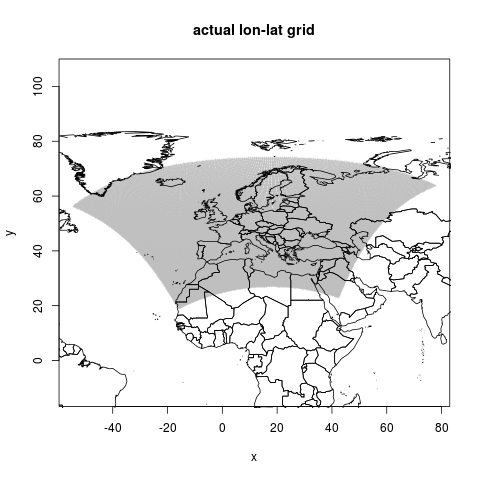
This is the actual geographic points, it shows a kind of fan of locations
#library(ncdf4)
library(ncdf)
library(raster)
projdir <- "~/projects/weather_european_eobs/eobs_temperature_tg_dataset"
outdir <- "data_provided"
outdir <- file.path(projdir, outdir)
#dir.create(outdir, recursive = T)
setwd(projdir)
dir()
# The URL below will get you the data, but the ECAD group do request you register your email address
# they probably use this information to report some usage stats to their funders, so
# Please do consider going to this webpage (http://www.ecad.eu/download/ensembles/ensembles.php)
# and register yourself.  Thanks!
webroot <- "http://www.ecad.eu/download/ensembles/data/Grid_0.22deg_rot"
# Create a list of netcdf files to download, we can loop over it
file_list <- c("tg_0.22deg_rot_1950-1964_v12.0.nc.gz","tg_0.22deg_rot_1965-1979_v12.0.nc.gz")

# only download if not already done
setwd(outdir)
for(i in 1:length(file_list))
    {
    dl <- file.path(webroot, file_list[i])
    dl
    infile <- basename(dl)
    exists  <- dir(pattern= infile)
    if(
      !exists("exists")
       )
    {
    download.file(dl, destfile = infile, mode = "wb")
    system(sprintf("gunzip %s", infile))
    }
    " (250MB)"
    }
setwd(projdir)

# now we can go through all days, I set this up as a loop over ncdf files then days,
# but I'll probably try to set this up to directly use the netCDF aggregation functions available and avoid looping
# for(j in 1:length(file_list))
  #{
    j = 1
    infile <- file.path(outdir, gsub(".gz", "", file_list[j]))
    nc <- open.ncdf(infile)
    #str(nc)
    print(nc)
    #?get.var.ncdf, following the example in the help file
    print(paste("The file has",nc$nvars,"variables"))
    var_i      <- nc$var[[4]]
    #var_i
    varsize <- var_i$varsize
    ndims   <- var_i$ndims
    nt      <- varsize[ndims]  # Remember timelike dim is always the LAST dimension!
    #nt
    # we will set up to do a loop over days, I want to
    # a) read in the day grid
    # b) make a spatial points file with the appropriate projection
    # c) convert to geotiff and save to disk
    #for(i in 1:nt)
    #  {
        i = 1
       # Initialize start and count to read one timestep of the variable.
       start <- rep(1,ndims)   # begin with start=(1,1,1,...,1)
       start[ndims] <- i       # change to start=(1,1,1,...,i) to read timestep i
       count <- varsize        # begin w/count=(nx,ny,nz,...,nt), reads entire var
       count[ndims] <- 1       # change to count=(nx,ny,nz,...,1) to read 1 tstep
       data3 <- get.var.ncdf( nc, var_i, start=start, count=count )

       # Now read in the value of the timelike dimension
       timeval <- get.var.ncdf( nc, var_i$dim[[ndims]]$name, start=i, count=1 )

       print(paste("Data for variable",var_i$name,"at timestep",i,
               " (time value=",timeval,var_i$dim[[ndims]]$units,"):"))
       # [1] "Data for variable tg at timestep 1  (time value= 0 days since 1950-01-01 00:00 ):"
       #print(data3)
       #image(data3)
       dat1 <- list()
       dat1$x <- get.var.ncdf(nc, varid="Actual_longitude")
       #dat1$x <- dat1$x[,1]
       dat1$y <- get.var.ncdf(nc, varid="Actual_latitude")
       #dat1$y <- dat1$y[1,]
       dat1$z <- get.var.ncdf(nc, var_i, start=start, count=count )
       str(dat1$z)
       #image(dat1$z)
       #map("world", xlim = c(xmin, xmax), ylim = c(ymin, ymax))
       #with(dat1, points(x, y, cex = .1, pch = 16))
       dat2 <- data.frame(
         x = as.vector(dat1$x),
         y = as.vector(dat1$y),
         z = as.vector(dat1$z)
         )
       #str(dat2)
       #getwd()
       # I had the idea to save each day out to a file for looping over again and extracting spatially located data
       # say for a pixel, but I decided to try out the netCDF aggregation tools at a next step
       # save(dat2, file = sprintf("data_derived/eobs_tg_%s.RData",i))
       #load(sprintf("eobs_tg_%s.RData",i))
       #This seemed like a good idea, but RData is more compressed
       # write.csv(dat2, sprintf("eobs_tg.csv",i), row.names = F, na = "")
       #}
#}

# load the data for a specific day as example
dir("data_derived")
infile  <- "eobs_tg_1.RData"
load(file.path("data_derived/", infile))
ls()
# Now this is able to be mapped, but have make sure of the projection
library(maptools)
library(scales)
library(RColorBrewer)
library(rgdal)
# the following code was adapted from

# Bedia, J. (2012). R practice using data from the ENSEMBLES
# Project. Retrieved from
# http://www.value-cost.eu/sites/default/files/VALUE_TS1_D02_RIntro.pdf

data(wrld_simpl)
# loads the world map dataset
wrl  <- as(wrld_simpl,"SpatialLines")
l1 <- list("sp.lines",wrl)
#x <- get.var.ncdf(nc, varid="Actual_longitude")
str(x)
x <- as.vector(x)
#y <- get.var.ncdf(nc, varid="Actual_latitude")
str(y)
y  <- as.vector(y)


coords <- cbind(x, y)
str(coords)
head(coords)
# so the actual lat lons are not regular grid in degrees
png("figures_and_tables/qc_actual_xy.png")
plot(coords, asp=1, cex=.4, col="grey",
  pch="+", main=("actual lon-lat grid"))
lines(wrl)
dev.off()
This is the first graphic shown above, it shows a kind of fan of locations
# so what does the rotated grid look like in its own universe?
str(dat1$z)
png("figures_and_tables/qc_rotated.png")
image(dat1$z)
dev.off()
This is how it looks on rotated grid
# so now add in the temperatures, use the wgs latlongs
t <- as.vector(dat1$z)
dat3 <- cbind.data.frame(coords, t)
summary(dat3)
coordinates(dat3) <- c(1,2)
#names(dat3@data) <- c("z")
str(dat3)
summary(dat3@data)
color.palette <- rev(brewer.pal(11,"Spectral"))
getwd()
dir()
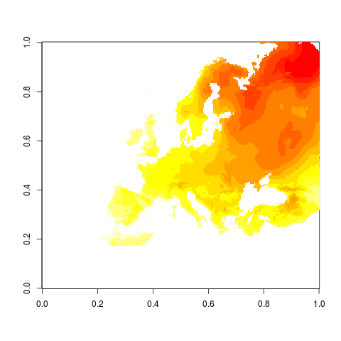
png("figures_and_tables/qc_tempmap_wgs.png")
spplot(dat3, scales=list(draw=TRUE), sp.layout=list(l1),
col.regions=alpha(color.palette,.2), cuts=10,
main="tg")
dev.off()
# write out the data to a shapefile
# we first have to make sure that the proj4 string is ok
str(dat3)
proj4string(dat3) <- "+proj=longlat +ellps=WGS84 +datum=WGS84 +no_defs +towgs84=0,0,0"
setwd(file.path(projdir, "data_derived"))
writeOGR(dat3, "out2.shp", "out2", "ESRI Shapefile")
setwd(projdir)
# to look at the rotated project do the following
# need to look at the website to get this info
# http://opendap.knmi.nl/knmi/thredds/dodsC/e-obs_0.22rotated/tg_0.22deg_rot_v12.0.nc.html
print(nc)
# it doesn't seem like there is this info in the ncdf file?
get.var.ncdf(nc, "projection")
rcm.lonlat.grid <- SpatialPoints(coords)
# now set this to wgs84
proj4string(rcm.lonlat.grid) <-"+proj=longlat +ellps=WGS84 +datum=WGS84 +no_defs +towgs84=0,0,0"
# this is the proj from website
# +proj=ob_tran +o_proj=longlat +lon_0=18 +o_lat_p=39.25 +a=6367470 +e=0
rcm.lambert.proj4 <- CRS("+proj=ob_tran +o_proj=longlat +lon_0=18 +o_lat_p=39.25 +a=6367470 +e=0")
# do the transform
spTransform(rcm.lonlat.grid, rcm.lambert.proj4) -> rcm.lambert.grid
summary(rcm.lambert.grid)
world.trans <- spTransform(wrl, rcm.lambert.proj4)
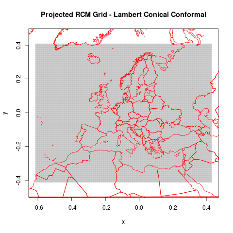
png("figures_and_tables/qc_rotated_grid_and_countries.png")
plot(rcm.lambert.grid@coords, cex=.2, pch=3, asp=1, col="grey",
main="Projected RCM Grid - Lambert Conical Conformal")
lines(world.trans, col="red")
dev.off()
This shows the rotated world countries
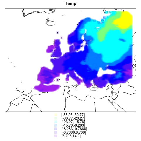
pr.df <- cbind.data.frame(coordinates(rcm.lambert.grid), dat3@data)
coordinates(pr.df) <- c(1,2)
l1  <- list("sp.lines", world.trans)
color.palette <- colorRampPalette(c("yellow","cyan", "blue","purple"))

# This graph shows this with temp
png("figures_and_tables/qc_rotated_grid_and_countries2.png")
spplot(pr.df, sp.layout=list(l1), cuts=7, cex=1.5,
  col.regions=alpha(color.palette(7),.15), pch=rep(15,7),
  main="Temp")
dev.off()
# not much point writing this to shapefile?
#proj4string(pr.df)  <- rcm.lambert.proj4
#str(pr.df)
#setwd(file.path(projdir, "data_derived"))
#dir()
# writeOGR(pr.df, "out.shp", "out", "ESRI Shapefile")
this one has temperatures too
acknowledgement and citations.
E-OBS temperature and precipitation:
We acknowledge the E-OBS dataset from the EU-FP6 project ENSEMBLES
(http://ensembles-eu.metoffice.com) and the data providers in the
ECA&D project (http://www.ecad.eu)
Haylock, M.R., N. Hofstra, A.M.G. Klein Tank, E.J. Klok, P.D. Jones,
M. New. 2008: A European daily high-resolution gridded dataset of
surface temperature and precipitation. J. Geophys. Res (Atmospheres),
113, D20119, doi:10.1029/2008JD10201”