
I concur with Jeff Leek that once spent time learning base graphics in R there is less incentive to learn ggplot2 http://simplystatistics.org/2016/02/11/why-i-dont-use-ggplot2/
However I always hate the way barplot works. Here is an example:
qc <- read.csv(textConnection("id,  OnlinePaper, Q, freq, totals,       prop
1,      Online,         ,1768,   9950, 0.17768844
2,      Online,      No ,4022,   9950, 0.40422111
3,      Online,     Yes ,4160,   9950, 0.41809045
4,       Paper,         , 256,   3355, 0.07630402
5,       Paper,      No , 979,   3355, 0.29180328
6,       Paper,     Yes ,2120,   3355, 0.63189270"))

qc1 <- cast(qc, OnlinePaper ~ Q74 , value = "prop")
qc1
barplot(as.matrix(qc1), beside = T, legend.text = qc1[,1], ylim = c(0,1))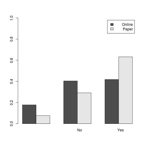
ggplot(data=qc, aes(x=Q, y=prop, fill=OnlinePaper)) +
    geom_bar(stat="identity", position=position_dodge())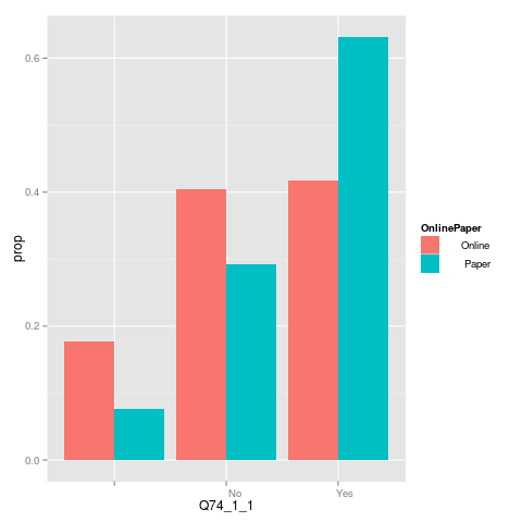
Going to extremes
I should say though that I have found barplot can produce very customised graphs that serve a specific purpose such as that below (I have de-identified the content as this is unpublished research)
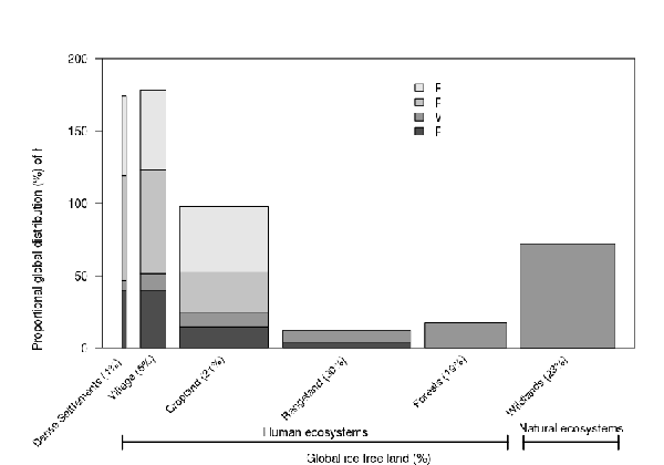
This made heavy use of the following approach
# original by Joseph Guillaume 2009
SideBySideBarPlot2 <- function(aggAllData, ...) {
  par(mar=c(8,7,4,2))
  bp<-barplot(aggAllData,
              horiz=FALSE,
              col=gray.colors(nrow(aggAllData)),
              las=1, axisnames = FALSE, ...)
  labels <- names(as.data.frame(aggAllData))
  text(bp, par('usr')[3], labels = labels, srt = 45,
       adj = c(1.1,1.1), xpd = TRUE, cex=.9)
    return(bp)
}
# with width = xvar (proportions)