Welcome to my Open Notebook

This is an Open Notebook with Selected Content - Delayed. All content is licenced with CC-BY. Find out more Here.

ONS-SCD.png

My view of the research data analysis pipeline

I put these ideas down when I gave a talk for the Aust National Data Service (ANDS) training course for data librarians at universities.

  1. Finding out about data
  2. Getting data
  3. Putting data somewhere
  4. Doing stuff with data
  5. Finding out what has been done with data
  6. Sharing data with others

I suggest that the future needs actions that support each of these activities at the following levels:

  1. Individual researcher
  2. Research group
  3. Research centre
  4. Faculty/Institute
  5. University
  6. Multi-university collaborative groups (e.g. CRC or CRE)

The government and private sectors may have some similarities, but I don’t know.

Posted in  swish


The impact of scale on associations between disadvantage and hospitalization for heart diseases

Disadvantage and disease hidden in plain sight: University of Canberra study

Disease mapping has been used as a modern tool for identifying risks and informing public health policy, but researchers at the University of Canberra say the real story of socio-economic disadvantage and disease is often hidden.

University of Canberra Health Research Institute (HRI) research shows that often the wrong geographical scale is being used for disease mapping which obscures the statistical associations of risks and health outcomes.

These findings are part of HRI’s Impact of scale of aggregation on associations of cardiovascular hospitalization and socio-economic disadvantage paper which has been published on 29 November 2017 in the journal PLOS One http://journals.plos.org/plosone/article?id=10.1371/journal.pone.0188161.

HRI’s data scientist and lead author of the report, Dr Ivan Hanigan, said that “in order to protect the anonymity of health data, government authorities prefer large scale mapping, which impacts the evidence they need for policy responses. It’s left them with little detail and a picture that doesn’t reflect reality,” Dr Hanigan said.

“The salt-and-pepper approach to Canberra’s public housing and high-density living, which means low socio-economic groups are spread out throughout the city’s suburbs, hides the disadvantage when studied at certain scales. Current disease mapping often shows a uniform level of health problems at suburb level or above, but by drilling it down to a smaller, neighbourhood level you begin to see a very different story,” Dr Hanigan said.

He said that, for example, it is globally well known that socio-economic disadvantage is associated with more heart disease problems.

“Being able to peer down to street-level maps of disadvantage can reveal these pockets of very high risk, right in the middle of some of our more affluent suburbs.

“Health data administrators are restricted by certain interpretations of the privacy laws and this has unintentionally led to the suppression of data access by researchers. Our ability to make adequate disease maps and do correlation analysis is then hampered,” Dr Hanigan said.

“A lot of money is being spent on data collection and this needs to be better used to improve public health, especially risk identification and prevention. There is a trade-off between the public health benefits of geographical research on health versus the protection of individual privacy.”

The study examined low scale statistical areas and compared them with larger scale areas to uncover the differences in risk factors and health problems. Dr Hanigan said they found that rates of heart attack hospitalisation had distinct peaks and troughs across most suburbs when using low scale analysis.

“When we examined the same areas at larger scale, we found those peaks and troughs largely disappeared becoming far smoother across these suburbs. In some cases, these suburb-level results were four times lower than the rates seen in low scale analysis.

“It’s clear that the scale of analysis can change the understanding of geographical patterns of risk factors and diseases. This needs to be taken into account in planning future health data analysis, and when health authorities and the government review the evidence and work on population health policies,” Dr Hanigan said.

The report is co-authored by University of Canbera Professor of Public Health Tom Cochrane and HRI Director Professor Rachel Davey.

Posted in  swish


New paper on neighbourhood level air pollution for health research

This post is to announce an recent paper we got published:

Blending multiple nitrogen dioxide data sources for neighborhood estimates of long-term exposure for health research. Ivan Charles Hanigan, Grant J Williamson, Luke David Knibbs, Joshua Horsley, Margaret Rolfe, Martin Cope, Adrian Barnett, Christine Cowie, Jane S Heyworth, Marc L Serre, Bin Jalaludin, Geoffrey G Morgan. 2017, Environmental Science & Technology, http://dx.doi.org/10.1021/acs.est.7b03035

Exposure to nitrogen dioxide (NO2) pollution has been associated with a range of adverse health outcomes for both the respiratory and cardiovascular systems. This pollutant is primarily emitted by traffic and can reach very high levels next to roads, and diminish quickly away from the source. Spatial models of pollution concentrations are often used to estimate exposure levels that are then fed into models that estimate health impacts. However, these estimates can be imprecise due to difficulty modelling spatial patterns at the resolution of neighbourhoods (e.g. a scale of tens of metres) rather than at a coarse scale (around several kilometres). This is especially challenging at low concentrations, such as the level found in Sydney Australia. The Sydney region has globally low levels of air pollution compared with similar economically developed cities. Rome for example is a similar size yet mean NO2 was three times higher than the average in Sydney.

The objective of our research was to derive improved estimates of neighbourhood level pollutant concentrations for health studies by blending air pollutant measurements with modelled predictions using the Bayesian statistical philosophy. The improved estimates of exposure will theoretically reduce bias when used in second stage analyses of the impacts on health. This improved evidence will guide decision makers in the delicate balance between the costs of reducing air pollution emissions, while minimising health impacts.

In our paper that has just been accepted for publication in the journal Environmental Science & Technology we implemented a high-tech method called the Bayesian Maximum Entropy (BME) model to blend data based on our prior knowledge of the probabilities and uncertainty surrounding the information sources. We brought together all the different NO2 data from measuring stations (monitors), chemical transport models (physical models that mimic the dispersion of emissions and weather patterns), and statistical ‘land use regression’ models (which incorporated satellite-based data) to estimate neighbourhood level annual average NO2 concentrations in Sydney. Our validation assessment using independent data from a separate set of samples showed an improvement compared to either the land use regression and chemical transport model used alone.

How low should we go? Is there a ‘safe’ low threshold of air pollution for Australians?

Future outputs of our work will seek to enable the policy and management communities to develop further improvements to air pollution maps and to explore health cost-benefit estimates under various emission reduction scenarios. For example, the Australian National Environment Protection Council decides on the National Environment Protection Measures (NEPMs) which have the goal of achieving a safe threshold of exposure in our cities. The results of our research will inform these stakeholders as they revise the regulations, and try to achieve the National Clean Air Agreement (made between the Commonwealth and each state and territory jurisdictions) which aims to implement strengthened laws that move to even tighter standards on air pollution emissions by 2025.

Key talking points:

  • Air pollution health impacts are well known from studies in high concentration cities (e.g. Rome) but there is a lack of knowledge about how low we need to go to minimise health impacts.
  • Sydney has globally low levels of NO2 (a traffic related air pollutant) and this makes Australia one of the best places in the world to study this low end of the exposure spectrum.
  • Our study produced an air pollution map with the best validation statistics for NO2 made so far for Sydney, at a scale of hundreds of metres.
  • These more precise exposure estimates will produce better knowledge about the health impacts.
  • With this evidence we can make better choices on regulatory interventions that seek to maximise the health benefits of reducing air pollution emissions while also delivering the lifestyle and economic prosperity afforded by burning fossil fuel for energy.

Media release

A breath of fresh air – new pollution research from Australia

Calculating whether traffic-related air pollution exposure can make us sick even at low levels has stumped experts around the world, but new research from a collaboration among eight universities and the CSIRO is now filling in the blanks. Nitrogen dioxide (NO2) is a pollutant mostly emitted by traffic and has been associated with respiratory and cardiovascular health problems.

The research, Blending Multiple Nitrogen Dioxide Data Sources for Neighborhood Estimates of Long-Term Exposure for Health Research has been published in the journal Environmental Science and Technology.

Lead author Dr Ivan Hanigan from the University of Canberra’s Health Research Institute and the Centre for air quality and health Research and evaluation (CAR) based at University of Sydney says past studies of NO2 pollution have focused on major cities around the world, mostly with severe problems.

“We know about the health impacts because of research which examined cities like Rome, which have very high concentrations of pollution,” Dr Hanigan said. “While, Sydney is about the same size as Rome; the Italian capital has three times higher levels of NO­2 pollution. It is still a big unknown if there might be a safe lower threshold where health impacts are minimal. If there is, then emission reduction policies can use this as a target, but if not then continual pollution reduction measures may be justified. Sydney is therefore one of the best places in the world to study this, and we can help answer this globally significant question.”

“Using the very precise air quality monitors installed around Sydney, along with sophisticated modelling by my collaborators, we are gaining insights that other studies have missed about the lower levels of NO2 exposure. We’ve been able to produce the best maps so far of air pollution for Sydney, and the scale is down to a hundred metres or so.”

Previous analysis used scales of several kilometres, Dr Hanigan says his new maps are much closer to the level of detail needed to accurately determine health impacts and plan for the future. “I expect health policy experts, infrastructure planners and even environmental managers will be keenly interested in this analysis,” he said. “This work can help to develop improvements to Australia’s air pollution regulations and lead to better health cost-benefit estimates for emission reduction scenarios.” “With this evidence we can make better choices on interventions to maximise the health benefits of reducing air pollution emissions while also delivering the lifestyle and economic prosperity afforded by burning fossil fuels for energy.”

The work is a collaboration between Dr Hanigan and colleagues from around Australia and the United States, including from University of Tasmania, University of Queensland, University of Sydney, CSIRO, Queensland University of Technology, University of New South Wales, University of Western Australia and the University of North Carolina.

Posted in  swish


Reproducible ecosystem risk assessment as virtual desktop case study

Our paper on a computational environment for reproducible workflows for climate change assessments is available for free access for limited time until Jan 28 via https://authors.elsevier.com/a/1UBJF5c6cKey5~

  • Guru, S., Hanigan, I. C., Nguyen, H. A., Burns, E., Stein, J., Blanchard, W., Lindenmayer, D., Clancy, T. (2016). Development of a cloud-based platform for reproducible science: A case study of an IUCN Red List of Ecosystems Assessment. Ecological Informatics, 36, 221–230. http://doi.org/10.1016/j.ecoinf.2016.08.003.

In this project we re-implemented a previously created project from an ArcGIS and R scripted process into a reproducible workflow in Kepler. That original analysis was for a climate change risk assessment using the IUCN Red list of Ecosystems Assessment framework and was done for Mountain Ash forests located in the Central Highlands of Victoria, Australia. This served as our case study.

Our aim was to demonstrate how this could be implemented as a more reproducible workflow and how it could be disseminated by creating a standalone computation environment for sharing the entire operating system and toolchain along with the work. The IT infrastructure we developed offers analysis tools as a “Platform as a Service” in a virtual desktop offered as a “Desktop as a Service” at https://www.coesra.org.au and new features are under development at https://portal.coesra.org.au. A R package of generic functions was created https://bitbucket.org/coesra/iucnecosystemriskassessment/src, and execution is possible as a pipeline of R scripts https://bitbucket.org/coesra/iucn_ecosystemriskassessment_mountainashforests as well as a Kepler workflow.

I made heavy use of the flowchart R function ‘newnode’ which I wrote as part of my PhD project (and is distributed in my own misc R package available on Github https://github.com/ivanhanigan/disentangle. This function takes a simple data.frame of steps, inputs and outputs and returns a string of text written in the dot language which can be rendered in R using the DiagrammeR package, or the standalone graphviz package. This creates the graph view shown below.

Alternative text - include a link to the PDF!

Posted in  reproducible research pipelines reproducible research reports reproducible research cloud building


One Health Ecohealth Conference Melbourne Dec 2016

I’ve just come out of an amazing 5 day conference on One Health (where animal health science meets human health science, and a whole lot of ecological thinking).

It was truly terrifying to hear about the cascading risks to health from environmental change. I was deeply affected by the story of monitoring worm infestation rates in children working in mines in the DRCongo, and saddened by the mass death of coral this year on the barrier reef (among many other tragic stories).

There was good news too:

  • Pepper and cinnamon fed to broiler chickens in India has been found to have antimicrobial properties
  • Bhutan have made progress with rabies
  • Yanks working with Ozzies are making progress on Hendra antibodies/vaccine for horses and humans
  • I met some very inspiring early career researchers and students
  • I met some equally inspiring senior scientists
  • My drought index/Government Drought Declarations poster was viewed by the former head of the Gov. Department who was in charge of the drought declarations (we agreed that the underlying governmental decision rules are vague and multipurpose, and a climate index has great value when looking at human ecology)

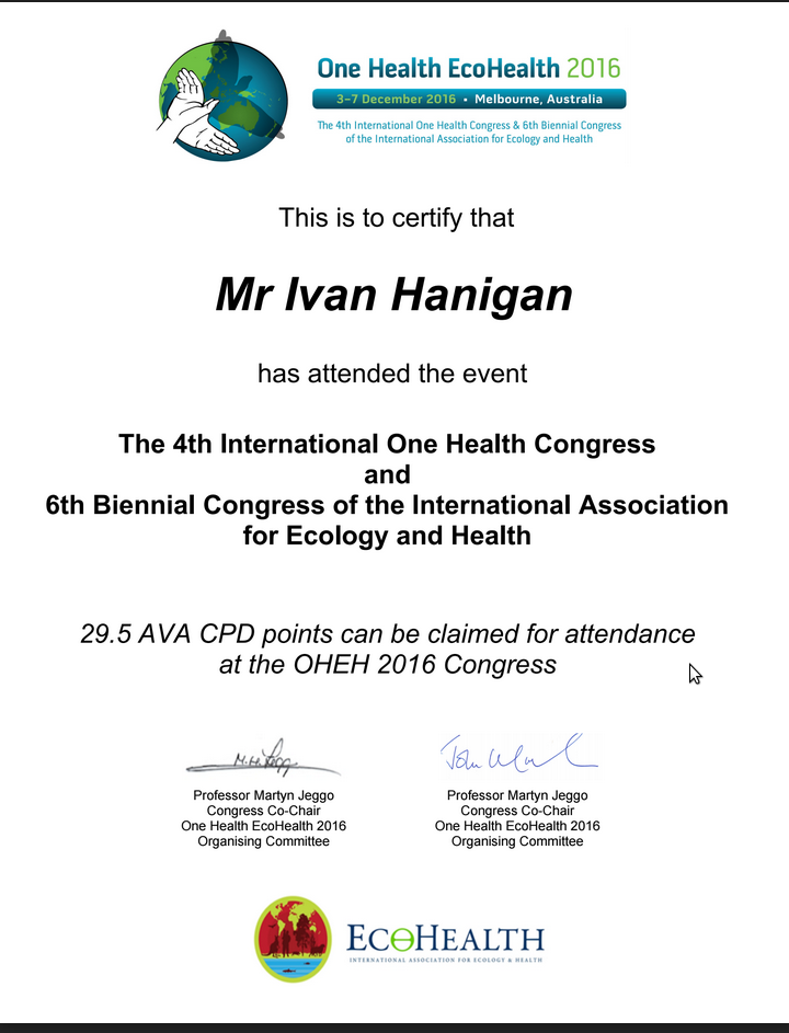
I also gathered some AVA CPD points (whatever they are!) as alerted by this certificate they sent me.

/images/ecohealth_cert.png

Posted in  training