Welcome to my Open Notebook

This is an Open Notebook with Selected Content - Delayed. All content is licenced with CC-BY. Find out more Here.

ONS-SCD.png

Reproducible Research And Managing Digital Assets (1 of 3). Scott Long wrote a book and some great tutorial slides

This will be a series of three posts that describe some key evidence based best practice methods that have helped me plan and organise files and folders for data analysis. I have found these via books and on websites.

  • Scott Long’s Workflow for Data Analysis with Stata
  • Josh Reich’s Least Commonly Fouled up Data analysis (LCFD) framework
  • John Myles White’s ProjectTemplate

Toward evidence based best-practice data management systems

It is important for open science to have effective management of digital assets across the different phases of the research pipeline. The traditional research pipeline moves from steps of hypothesis and design, measured data, analytic data, computational results (for figures, tables and numerical results), and reports (text and formatted manuscript). Reproducible research pipelines extend traditional research by encoding the steps in code from a computer ‘scripting’ language, and distributing the data and code with publications.

In this research pipeline context there are a large number of potential ways to manage digital assets (documents, data and code). There are also many different motivating drivers that will affect the way that a scientist or group of scientists choose to manage their data and code.

To deal with in house data management issues before starting and during analysis/reporting is critical for reproducible research.
I argue that more effective research pipelines can be achieved if scientists adopt the ‘convention over configuration’ paradigm and adopt best-practice systems based on evidence.

Long, S. (2015). Workflow for Reproducible Results.

For ages I was aware of the book from the Stata statistical program publishers http://www.indiana.edu/~jslsoc/web_workflow/wf_home.htm:

Citation:

Long, J. S. (2008). The Workflow of Data Analysis: 
Principles and Practice. Stata publishing.

Recently I stumbled across more recent workshop slides and tutorial material which I will discuss briefly.

Citation:

Long, S. (2015). Workflow for Reproducible Results. 
IV : Managing digital assets Workflow for Tools for your WF. 

Retrieved from http://txrdc.tamu.edu/documents/WFtxcrdc2014_4-digital.pdf

Long suggests a lot of practical things to do, but I will just focus here on the recommended file and folder structure:

\ProjectAcronym
    \- History starting YYYY-MM-DD
    \- Hold then delete 
    \Admin
    \Documentation 
    \Posted
         \Paper 1
             \Correspondence 
             \Text
             \Analysis
    \PrePosted 
    \Resources 
    \Write 
    \Work

  • In another workshop report Long provides a useful tool to automatically create this structure on windows
  • Long, S. (2012). Principles of Workflow in Data Analysis. Retrieved from http://www.indiana.edu/~wim/docs/2012-long-slides.pdf
  • a bash version would be useful for linux and mac users, but also the R language can do this on all platforms with the dir.create command

Code: wfsetupsingle.bat

# wfsetupsingle.bat 
REM workflow talk 2 \ wfsetupsingle.bat jsl 2009-07-12 
REM directory structure for single person.
FOR /F "tokens=2,3,4 delims=/- " %%a in ("%DATE%") do set CDATE=%%c-%%a-%%b 
md "- History starting \%cdate%" 
md "- Hold then delete " 
md "- Pre posted " 
md "- To clean" 
md "Documentation" 
md "Posted" 
md "Resources"
md "Text\- Versions\" 
md "Work\- To do"

Critical reflections

  • This recommendation is very sensible, especially the suggestion of moving things through the pipeline as they evolve from things being worked on (Write/Work) to later phases when they have been polished to a point that they can be put down while preparations for distrubuting them are made (Preposted) and then once they are sent off into downstream publication phases (Posted) they are locked for ever in a archival state.
  • I am not particularly keen on the names that have been chosen (Resources, Write and Work are quite ambiguous terms).

Posted in  disentangle


Organising Graph Nodes And Edges In A Dataframe

I use the R package DiagrammeR for creating graphs (the formal kind, connecting nodes with edges)

  • This package is great and I like how it interacts with the Graphviz program
  • One thing that I like to do in planning and organising data analysis projects is to make graphs and lists of the methods steps, inputs and Outputs
  • A simple way to organise these things is in a dataframe (table) with a column for each step (node) and two others for inputs and outputs (edges)
  • In my utilities R package github.com/ivanhanigan/disentangle I have written functions that turn this table into a graphiviz DOT language script
  • Recently I have needed to unpack the list for a more itemized view
  • Both these functions are showcased below

Code: newnode

# First create some test data, each step is a collection of edges 
# with inputs or outputs simple comma seperated lists
dat <- read.csv(textConnection('
cluster ,  step    , inputs                    , outputs                                , description                      
A  ,  siteIDs      , "GPS, helicopter"          , "spatial, site doco"                 , latitude and longitude of sites  
A  ,  weather      , BoM                       , exposures                              , weather data from BoM            
B  ,  trapped      , spatial                   , trapped_no                             , counts of species caught in trap 
B  ,  biomass      , spatial                   , biomass_g                              ,                                  
B  ,  correlations , "exposures,trapped_no,biomass_g" , report1                         , A study we published             
C  ,  paper1       , report1                   , "open access repository, data package" ,                                  
D  ,  biomass revision, new estimates          , biomass_g                              , this came late
'), stringsAsFactors = F, strip.white = T)    
str(dat)
# dat
      
# Now run the function and create a graph
nodes <- newnode(
  indat = dat,
  names_col = "step",
  in_col = "inputs",
  out_col = "outputs",
  desc_col = "description",
  clusters_col = "cluster",
  nchar_to_snip = 40
  )  
sink("Transformations.dot")
cat(nodes)
sink()
#DiagrammeR::grViz("Transformations.dot")
system("dot -Tpng Transformations.dot -o Transformations.png")
browseURL("Transformations.png")

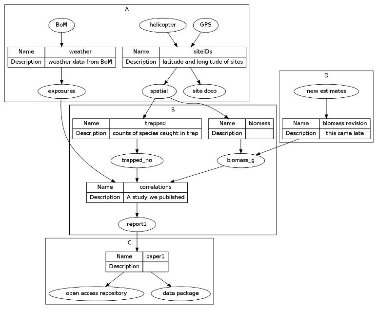
That creates this diagram

/images/Transformations.png

Now to showcase the tool that itemizes this list of inputs and outputs

  • The original table has no capacity to add detail about each node as they are held as a list of inputs and outputs
  • To add detail for each we need to unpack each list and create a new table with one row per node
  • I decided to make this a long table with an identifier for each node about which step (edge) the node is an input or an output

Code: newnode_csv

nodes_graphy <- newnode_csv(
  indat = dat,
  names_col = "step",
  in_col = "inputs",
  out_col = "outputs",
  clusters_col = 'cluster'
  ) 
# which creates this table
knitr::kable(nodes_graphy)
|cluster |name             |in_or_out |value                  |
|:-------|:----------------|:---------|:----------------------|
|A       |siteIDs          |input     |GPS                    |
|A       |siteIDs          |input     |helicopter             |
|A       |siteIDs          |output    |spatial                |
|A       |siteIDs          |output    |site doco              |
|A       |weather          |input     |BoM                    |
|A       |weather          |output    |exposures              |
|B       |trapped          |input     |spatial                |
|B       |trapped          |output    |trapped_no             |
|B       |biomass          |input     |spatial                |
|B       |biomass          |output    |biomass_g              |
|B       |correlations     |input     |exposures              |
|B       |correlations     |input     |trapped_no             |
|B       |correlations     |input     |biomass_g              |
|B       |correlations     |output    |report1                |
|C       |paper1           |input     |report1                |
|C       |paper1           |output    |open access repository |
|C       |paper1           |output    |data package           |
|D       |biomass revision |input     |new estimates          |
|D       |biomass revision |output    |biomass_g              |

This can now be useful for making a ‘shopping list’ of the data to aquire, transform, analyse or archive.

Posted in  disentangle


Open Notebook Science, Jekyll Blogs, Github and Jerry Seinfeld's Secret to Productivity

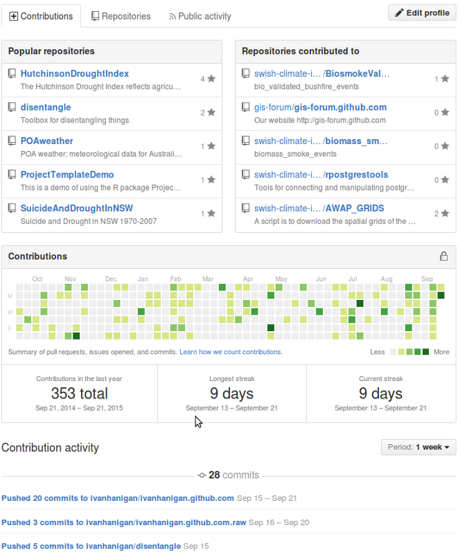
The other day I reported that I’ve implemented a new open science task management regime http://ivanhanigan.github.io/2015/09/task-management-like-an-open-science-hacker/.

This was instigated by my renewed enthusiasm for open science after a few high profile papers have come out in the last few months imploring scientists to take action on shonky statistics and the “morass of poorly conducted data analyses, with errors ranging from trivial and strange to devastating” (Peng 2015) http://dx.doi.org/10.1111/j.1740-9713.2015.00827.x.

I believe that making ones electronic notebook open is one of the most obvious and easily achieved things to do toward that ambition. I also think that keeping the TODO-list in the forefront of ones mind and continuously checking things off the list is a great boost for productivity and keeping on track. This culminates in the advice to keep momentum by doing something toward the plan on a daily basis, no matter how trivial. This is sometimes called Jerry Seinfeld’s secret to productivity: Just keep at it. Don’t break the streak. http://dirk.eddelbuettel.com/blog/2014/10/12/.

So what was holding me back from a really useful daily publication of my open notebook? I showed last post how I manage tasks in Emac Orgmode (a task organiser and calendar/agenda rolled up with code execution for running R scripts etc). I also write my blog posts in orgmode.

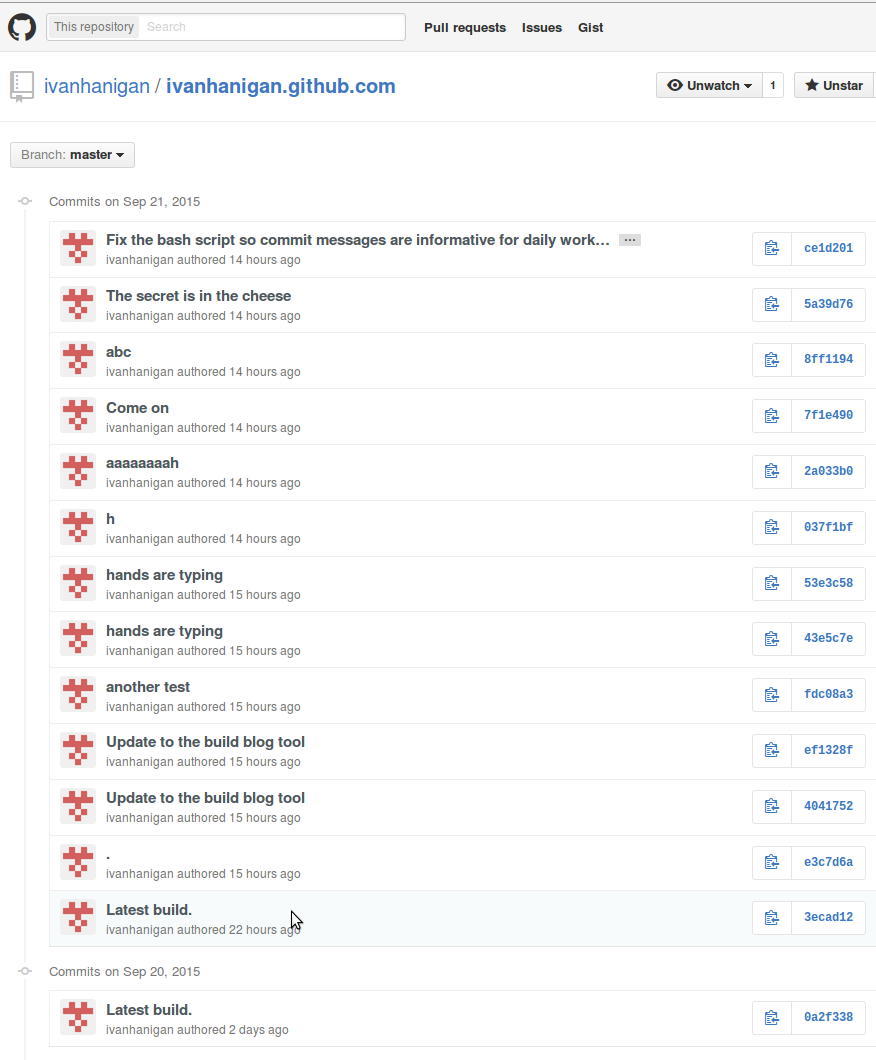
The only problem with that set up was that I was still using the code from Charlie Park http://charliepark.org/jekyll-with-plugins/ which adds the inadequate commit description ‘Latest build’ every time. What I needed was a way to actually log a summary of work each day, so I can look back over the history and know I actually did something everyday and was not just gaming the system by committing random little non-work additions (I want to balance this by doing some work every day, but also take time off to read, exercise, socialize, and generally have fun).

So anyway, the point of this post is to describe my revision to Charlie Park’s code for building a jekyll blog:

Code: put in ~/.bash_profile

function bb() {
  cd ~/projects/ivanhanigan.github.com.raw && jekyll b && cp -r    
  ~/projects/ivanhanigan.github.com.raw/_site/* ~/projects/ivanhanigan.github.com && 
  cd ~/projects/ivanhanigan.github.com && git add . -A  && 
  git commit -m "$*" && 
  git push
}

  • That bit about $* was a bit difficult for me to get working as this is the first time I have written a bash script in anger. The alternative was to use $1 and require the git commit message to be passed within quotes, which also makes sense but I did not do that.
  • I also needed to change the terminal settings so that it always loads the bash_profile

Bash terminal

Edit > Profile preferences
Title and Command > Run command as a login shell 

  • And so now I just have to deposit a markdown blog post into the jekyll _posts folder and then

Bash

bb Add a meaningful commit message about todays progress

There you have it, a meaningful message regarding what I have been doing towards my scientific output every day.

/images/seinfeld-streak-day9.png

/images/seinfeld-streak-day9.png

References

Peng, R. (2015). The reproducibility crisis in science: 
A statistical counterattack. Significance, 12(3), 30–32. 
doi:10.1111/j.1740-9713.2015.00827.x

Posted in  disentangle


My Newnode R Function Useful For Causal Directed Acyclic Graphs (DAGs)

Aims

I have worked on a function that turns a data.frame into a graphviz code in the dot language, with some of my preferred settings. I realised that it might be useful for causal directed acyclic graphs.

Causal diagrams are useful for conceptualising the pathways of cause and effect. These diagrams are sometimes simplly informal pictures but have also been developed in a more formal way to be used in modelling. These formal developments use concepts derived from the mathmatical abstraction of Graphs (fundamentally Graphs are networks of linked ‘nodes’, with the links being termed ‘edges’). Causal diagrams can either be constructed to depict two things: first are feedback loops (a vexatious property of complex systems that confounds modelling) while second are more simple chain-of-events type pathways which proceed from an upstream cause to a downstream effect in a single direction, without cycles, called ‘Directed Acyclic Graphs or DAGs. The loop diagrams are out of the scope of this present blog post because the DAGs are much more easily addressed by the tool that I am describing.

To begin I am going to build on this other guy’s blog post on causal DAGs with R http://donlelek.github.io/2015/03/31/dags-with-r/ I wanted to add an interface for building these.

Some background to the concepts that I use are provided in the references below.

Materials and Methods

The DiagrammeR package which has been integrated within R-Studio has made access to the graphing tool graphviz much easier than it used to be. My function causal_dag (avaiable in my disentangle github package) essentially constructs the required nodes and edges for that package to use. Optionally we can also include labels to indicate the direction of the effect.

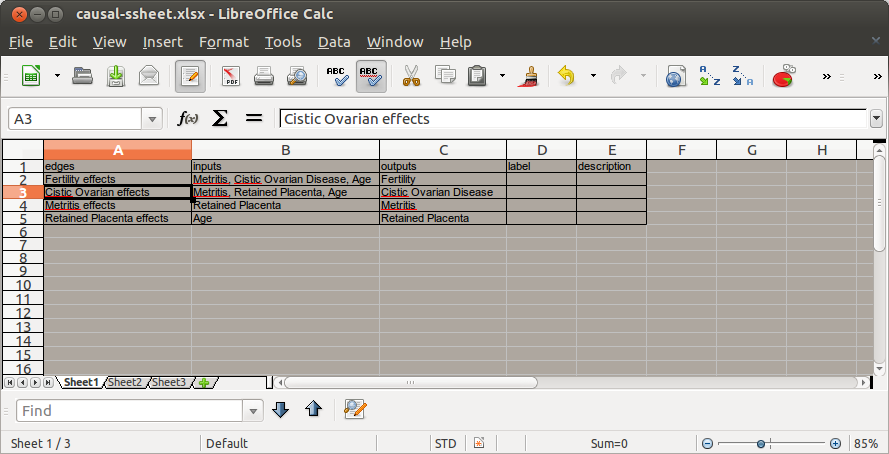
To use the tool all you need to do is create a list of edges and their associated inputs nodes and outputs nodes (as a comma separated values string) shown in the picture below.

causal-ssheet.png

Code:

# read in the sheet
library(disentangle)
library(stringr)
causes <- readxl::read_excel("causal-ssheet.xlsx")
causes
nodes <- newnode(causes, "edges", "inputs", "outputs")
cat(nodes)
# The result is a formated graph in the dot language with some of my
# preferred settings such as edges showing as 'records' and a spot to
# write a description or include literature about each process

  • See the DOT code in the Appendix
  • to render the graph now DiagrammeR can use this text string R object to render this to SVG
  • I think it does not do PNG or PDF though so I still use graphviz and dot directly

Code:

grViz(nodes)

# But I also use graphviz directly to produce a publishable image in
# pdf or png
sink("reproduce-donlelek.dot")
cat(nodes)
sink()# If graphviz is installed and on linux call it with a shell command
#system("dot -Tpdf reproduce-donlelek.dot -o reproduce-donlelek.pdf")
system("dot -Tpng reproduce-donlelek.dot -o reproduce-donlelek.png")

Results

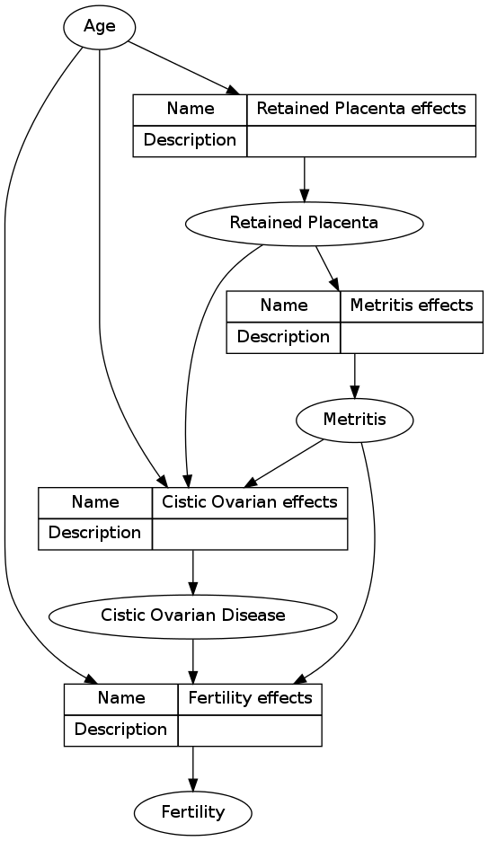
Here I have reproduced the work of donlelek

reproduce-donlelek.png

Future directions

  • I’d like to make the edges implicit, so that the spreadsheet keeps track of the information about the causal process, but the graph just shows the lines connecting the nodes
  • The edges are where the action is, so I need to add a direction of effect. This would be in a label column and added in a [ label = ‘abc’ ] tag for each edge
  • the rankdir option is LR to make this go sideways, which seems more the norm for causal DAGs, left to right.

References

Greenland, S., Pearl, J., & Robins, J. M. (1999). Causal diagrams for
epidemiologic research. Epidemiology (Cambridge, Mass.), 10(1),
37–48. doi:10.1097/00001648-199901000-00008
 
Reid, C. E., Snowden, J. M., Kontgis, C., & Tager, I. B. (2012). The
role of ambient ozone in epidemiologic studies of heat-related
mortality. Environmental Health Perspectives, 120(12),
1627–30. doi:10.1289/ehp.1205251
   
Newell, B., & Wasson, R. (2001). Social System vs Solar System: Why
Policy Makers Need History. In: Conflict and Cooperation related to
International Water Resources : Historical Perspectives. In World
Water (Vol. 2002).

Appendix

Code:

#####################################################################
# The following output is automatically created by newnode()
# NOTE for some reason, to show on the blog, I had to replace all { braces with normal (
#####################################################################
digraph transformations (
 
"Metritis" -> "Fertility effects"
"Cistic Ovarian Disease" -> "Fertility effects"
"Age" -> "Fertility effects"
"Fertility effects"  [ shape=record, label="(( ( Name | Description ) | ( Fertility effects |  ) ))"]
"Fertility effects" -> "Fertility"
 
 
"Metritis" -> "Cistic Ovarian effects"
"Retained Placenta" -> "Cistic Ovarian effects"
"Age" -> "Cistic Ovarian effects"
"Cistic Ovarian effects"  [ shape=record, label="(( ( Name | Description ) | ( Cistic Ovarian effects |  ) ))"]
"Cistic Ovarian effects" -> "Cistic Ovarian Disease"
 
 
"Retained Placenta" -> "Metritis effects"
"Metritis effects"  [ shape=record, label="(( ( Name | Description ) | ( Metritis effects |  ) ))"]
"Metritis effects" -> "Metritis"
 
 
 "Age" -> "Retained Placenta effects"
"Retained Placenta effects"  [ shape=record, label="(( ( Name | Description ) | ( Retained Placenta effects |  ) ))"]
"Retained Placenta effects" -> "Retained Placenta"
 
 
 )

Posted in  disentangle


If You Don't Find A Solution In R, Keep Googling!

I’ve learnt this lesson multiple times. It happens like this. A solution is not immediately obvious in R so you might think of writing your own function. Generally there is a solution you just did not google enough. This time I was tricked a little because the GIS functions have been bad for a long time but getting better very rapidly recently. A little while ago I had a very successful outcome from using the raster::extract function on a large raster file to get the attributes for a set of points. I needed to do the same thing but this time for a shapefile and points. I looked at the raster package and saw you can use the raster::intersect function here, and it worked on the small sample data I tested with but failed with the big dataset as it ran out of memory. I assumed that R had not caught up with the GIS world yet and so I came up with this workaround below by splitting the points data layer into chunks.

I then got access to ArcMap and was wondering whether it could do it, and it DID! So then I googled a bit and found the solution was simple:

Code:

sp::over()

Here is my hack in case I ever need to pull out the bit that does the splitting up of the points file, or the tryCatch():

Code:

big_pt_intersect <- function(pts, ply, chunks = 100){
  idx <- split(pts@data, 1:chunks)
  #str(idx)
  for(i in 1:length(idx)){
  #i = 1
  print(i)
    ids <- idx[ [i] ][,1]
  #str(pts@data)
  qc <- pts[pts@data[,1] %in% ids,]
  #str(qc)
  tryCatch(
    chunk <-  raster::intersect(qc, ply), 
    error = function(err){print(err)})
  if(!exists('chunk_out')){
  
    chunk_out <- chunk@data
  } else {
    chunk_out <- rbind(chunk_out, chunk@data)
  }
  rm(chunk)
  
  }
  #str(chunk_out)
  return(chunk_out)
}
# NB warning about split length multiple is not fatal, just due to nonequal chunks 
# (ie the geocodes are 2009/100)

Posted in  disentangle