
Using diagrams has long been a technique used in science to describe the relationships (edges) between things (nodes). Mathematics and geometry tools have been applied to ameliorate the problem of laying out the diagram for the most efficient use of space. It is desirable to minimise the gaps between the nodes and also to ensure that lines do not overlap too much. This is because the complexity of graphs obfuscates the details that we are trying to show. Visual grouping helps to disentangle the relationships.
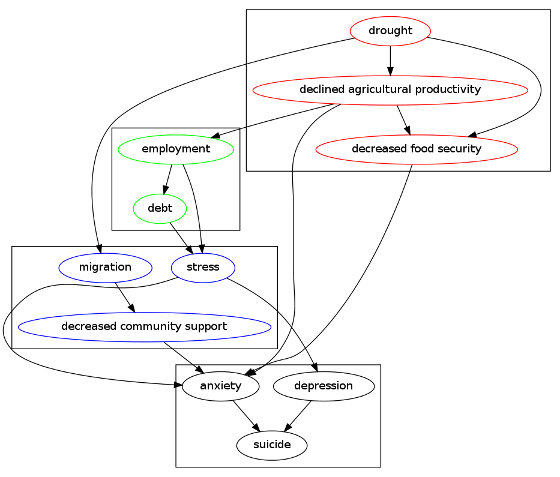
As an example, the relationship between drought and suicide is a complex system where the effects are indirect. The focus is on a chain of intermediary causal factors. These questions are usually explored in the context of many other factors that describe human biological variables and the socio-economic milieu.
In this post I utilise the R package DiagrammeR to construct a causal directed acyclic graph (DAG) of the putative effects of a set of selected causal factors from both natural and social capital theories.
The following code produces graph
Or this interactive version /viewhtml21f36d8c5d7d/index.html
library(DiagrammeR)
#### First create the outcome
nodes_outcome <- create_nodes(nodes = c('suicide','depression','anxiety'),
                        label = TRUE,
                        colour = "black")

edges_outcome <- create_edges(from = c('depression','anxiety'),
                        to =   c("suicide", "suicide")
                        )

graph_outcome <- create_graph(nodes_df = nodes_outcome,
                       edges_df = edges_outcome)
# just test this out
## render_graph(graph_outcome)

#### now the social capital factors
nodes_social <-
  create_nodes(nodes =  c("stress", "decreased community support", "migration"),
               label = TRUE,
               color = "blue")

edges_social <- create_edges(from =  c("stress", "stress", "decreased community support",
                          "migration"),
                        to =   c("anxiety", "depression", "anxiety",
                          "decreased community support")
                        )
graph_social <- create_graph(nodes_df = nodes_social,
                       edges_df = edges_social)
# render_graph(graph_social)

#### now the financial capital factors
nodes_financial <-
  create_nodes(nodes = c("employment", "debt"),
               label = TRUE,
               color = "green")

edges_financial <- create_edges(from = c("employment", "employment", "debt"),
                        to =   c("stress", "debt", "stress")
                        )
graph_financial <- create_graph(nodes_df = nodes_financial,
                       edges_df = edges_financial)
# render_graph(graph_financial)


#### now the natural capital factors
nodes_natural <-
  create_nodes(nodes = c("drought", "declined agricultural productivity", "decreased food security"),
               label = TRUE,
               color = "red")

edges_natural <- create_edges(from = c("drought", "drought", "declined agricultural productivity",
                          "declined agricultural productivity", "declined agricultural productivity",
                          "decreased food security",
                          "drought"),
                        to =   c("declined agricultural productivity", "decreased food security", "decreased food security",
                          "anxiety", "employment",
                          "anxiety",
                          "migration")
                        )
graph_natural <- create_graph(nodes_df = nodes_natural,
                       edges_df = edges_natural)
## render_graph(graph_natural)

# use create_graph on separate nodes and edges data frames, one for each cluster
# then access the dot codes for each
gr0 <- graph_outcome$dot_code
gr1 <- graph_social$dot_code
gr2 <- graph_financial$dot_code
gr3 <- graph_natural$dot_code
# then replace the graph with subgraph
gr0 <- gsub("digraph", "subgraph cluster0", gr0)
gr1 <- gsub("digraph", "subgraph cluster1", gr1)
gr2 <- gsub("digraph", "subgraph cluster2", gr2)
gr3 <- gsub("digraph", "subgraph cluster3", gr3)
# and then combine the subgraphs into one graph
gr_out <- sprintf("digraph{\n%s\n\n %s\n%s\n%s\n}", gr0, gr1, gr2, gr3)
cat(gr_out)
grViz(gr_out)
# If graphviz is installed and on linux call it with a shell command
sink("suicide-drought.dot")
cat(gsub("'",'"', gr_out))
sink()
system("dot -Tpng suicide-drought.dot -o suicide-drought.png")
# Interactive
nodes <- combine_nodes(nodes_outcome, nodes_social, nodes_natural, nodes_financial)
edges <- combine_edges(edges_outcome, edges_social, edges_natural, edges_financial)

# Render graph
graph <- create_graph(nodes_df = nodes,
                      edges_df = edges)

render_graph(graph, output = "visNetwork")