
I stumbled on these posts about python and IPython Notebook by “Data Scientist Training for Librarians”:
- http://altbibl.io/dst4l/exploratory-data-analysis-and-statistics-using-pandas-and-matplotlib/
- http://altbibl.io/dst4l/pandas-munging-stats-and-visualization/
I;ve been wanting to learn more python. I don’t think it’ll be ready for statistical modelling for a while, but I a want to be ready when it is. You can get my ipython notebook file for this here: olive.ipynb, but first run the following R code snippet to get the replication dataset ‘olive.csv’ into your home directory.
R Code: get the olive oil dataset
install.packages("pgmm")
require(pgmm)
data(olive)
names(olive) <- tolower(names(olive))
str(olive)
write.csv(olive, "olive.csv", row.names = F)
# actualy home might be easier for ipython to access
write.csv(olive, "~/olive.csv", row.names = F)
OK now reproduce the example
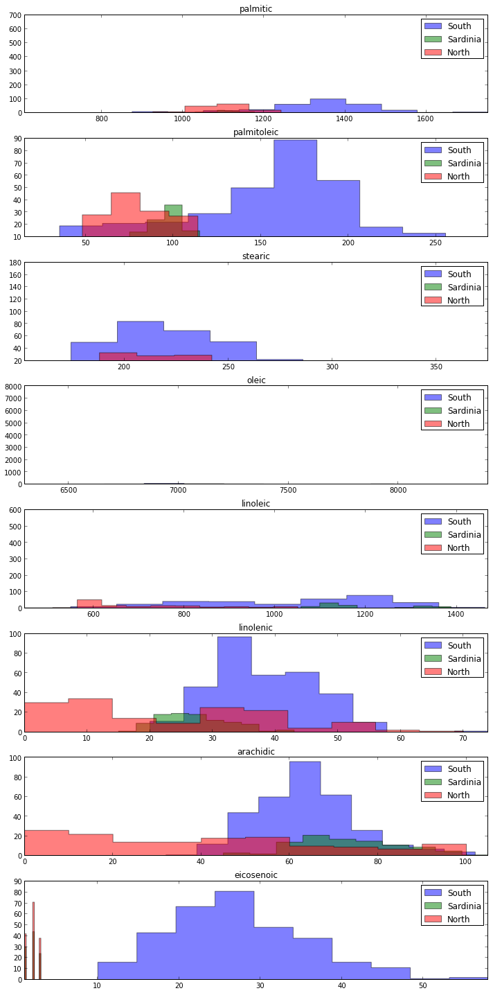
I quite like the histograms from the second example. Here is the raw code extracted from the ipynb
Code:
%pylab inline
import numpy as np
import matplotlib.pyplot as plt
import pandas as pd
import matplotlib.colors as colors

acidlist=['palmitic', 'palmitoleic', 'stearic', 'oleic', 'linoleic', 'linolenic', 'arachidic', 'eicosenoic']
dfsub=df[acidlist].apply(lambda x: x/100.0)
dfsub.head()

rkeys=[1,2,3]
rvals=['South','Sardinia','North']
rmap={e[0]:e[1] for e in zip(rkeys,rvals)}
rmap

fig, axes=plt.subplots(figsize=(10,20), nrows=len(acidlist), ncols=1) # sets up the framework for the graphs. Acidlist is defined elsewhere, and is a list of the acids we’re interested in.
i=0 # Sets a counter to 0

for ax in axes.flatten(): # Starts a loop to go through our plot and render each row

    acid=acidlist[i]
    seriesacid=df[acid] # creates seriesacid and sets it to df[acid], a list of the percent composition of the acid in the current iteration that’s in each olive oil.

    minmax=[seriesacid.min(), seriesacid.max()] # the minimum and maximum values plotted will be the minimum and maximum percentages that we find in the data

    for k,g in df.groupby('region'):  # starts a loop in the loop to plot the values by region
        style = {'histtype':'stepfilled', 'alpha':0.5, 'label':rmap[k], 'ax':ax}
        g[acid].hist(**style)

        ax.set_xlim(minmax)

        ax.set_title(acid)

        ax.grid(False)

        #construct legend
        ax.legend()
    i=i+1 # increments the counter, to move the loop on to the next acid.

    fig.tight_layout()
Conclusions
- I am not sure how to do the transparency but the rest of it would make more sense to me with R
- Will try to reproduce in R for head-to-head shoot out.
- I also plan to look into the new shinyAce browser based R editor for similar work
- I’m still really enjoying Emacs Orgmode for this kind of functionality though and thoroughly recommend KJ Healy’s starter kit
- (I’ve installed and config thison Ubuntu, Windoze and Mac, but LaTeX and exporting R code can be tricky)